I’ve been looking for an excuse to try R for a couple months, and the FiveThirtyEight Dataset of Uber pickups on Kaggle gave me that opportunity I was looking for.
I’d done some tutorials in R prior to this project, so I was relatively familiar with the syntax and some of the base level constructs that R is based in - the prevalence of vectors, R’s version of DataFrames, etc. I’d highly recommend swirl and RStudio as a good starting point for anyone wanting to get into R.
That being said, working with ‘real’ data in R still took a bit of time to get used to. Unfortunately, my dataset had a lot of datetimes in it, so I immediately ran into R’s relatively poor way of handling dates - at least, in comparison to Python.
However, R does have a leg up on the common Python packages - matplotlib, seaborn, etc - on integrating plotting deep into the language. Additionally, with RStudio, you see your plots immediately right in the IDE, which is awesome. I don’t have anything against Jupyter Notebooks, but having a good IDE and being able to see essentially inline plots is a big win for R.
After a few hours of mucking around, I am relatively happy with the results I was able to get out of R. What I was most impressed by - as far as R’s plotting libraries go - was the mapping libraries. The built-in maps package and ggmap far exceeded anything that I’ve been able to do in Python. Here’s one of my first plots, where I just mapped Uber pickups in the month of April, 2014:
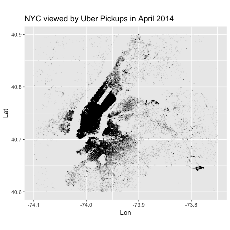
Pretty cool. (I took a lot of inspiration in the project from the excellent Max Woolf’s writeup on taxi data visualization)
I’m not sure exactly why yet, but when I’m working with and plotting data in R, it feels like I’m able to let the data “speak for itself” much more than in Python. Perhaps it’s a shiny-object psychological trick on my part, but I think R’s idioms around data handling lend itself really well to producing good looking data visualizations.
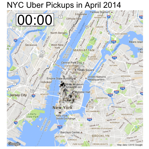
R also has a decent animation package, which let me make this pretty easily:
In the end, I probably won’t switch away from Python to R. It’s clear that Python has the upper hand as far as data retrieval, and the two are fairly competitive on the data transformation end of things. R seams to be better for statisticians, as it’s packages tend to skew towards utilities for that discipline, but I wouldn’t trust my judgement on that. It also appears that R has a slight edge on Python as far as visualization.
All in all, R is another good tool for working with data, and I hope to have more excuses to use it in the future.
For what it’s worth, the code that produced these visualizations is available here on my Github.
Cover: Flickr