Over the past few years, GamesDoneQuick has become quite a livestream phenomena as a biannual charity livestreams of games from throughout the history of video games. I love watching these streams, and because of the unique dataset, was interested in the relationships between games, platforms, release years, and the current speedrun ’time-to-beat’. With SummerGamesDoneQuick 2016 rapidly approaching, I decided it’d be a good time to make some visualizations.
Being a Python nerd, I started my data visualization with an Jupyter notebook and a generous application of matplotlib.
Scraping the Data
To actually get all the game, platform, and runtime data, I first used BeautifulSoup to scrape the schedule off the SGDQ website. This was simple enough: I just had to blacklist some of the non-game entries on the schedule (like setup times) and I had a decent list of all the games.
What then came was a bit annoying; I wanted to get a record of all the platforms each game was released on, and decided on using the GiantBomb game catalog API. However, all I had were the names of the games as listed by SGDQ, which weren’t always a perfect match for GiantBomb. So, I had to do a rather tedious amount of manual conditioning of the data.
Additionally, I also recorded what platform each game was ‘actually’ going to be played on during the marathon.
Some quick input scripting in Jupyter, and I was able to vastly shorten the amount of time it took to do these manual entries.
Visualizing the Data
As I’ve come to do, I usually make several passes at each graph when I do visualizations. The first couple are to get a sense of what the data ’looks’ like, and the last is to make it look aesthetically decent.
That being said, here was what I threw together from this data set:
Game Release Platforms
This started with a pretty simple question: How many of each of these games could be played on each console?
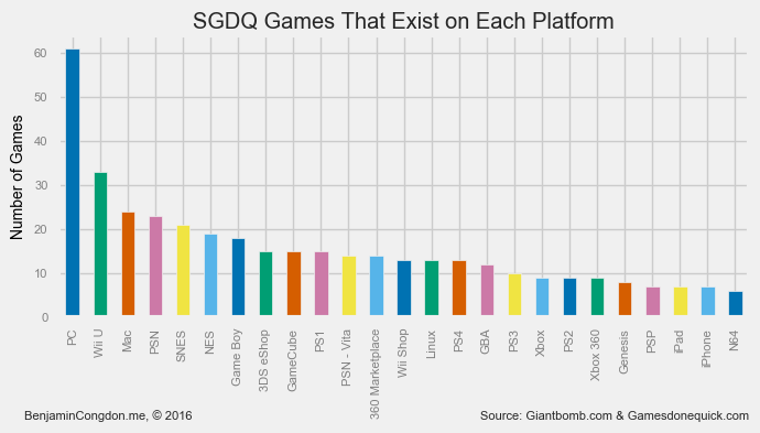
Unsurprisingly, of the ~163 games, a good ~38% of them can be played on PC - dwarfing the support on any of the other platforms. Interestingly, the Wii U beats out the Mac in support, likely because of Nintendo’s push for the Wii U Virtual Console eShop.
How about when we look at what each game in the marathon is actually being played on?
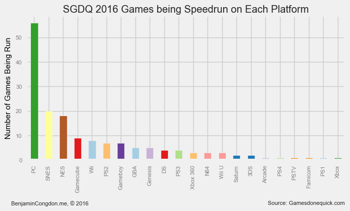
Well, then the preference for PC becomes even more apparent. There’s some more interesting trends in this graph too though: of the top 8 platforms being run, 6 of them are Nintendo platforms. Others like the Xbox and Playstation, which you would think would have a fair representation, get relegated farther down the ranking.
I would bet that this is because given the choice on a cross-platform game between a PS2 and PC, most runners go for the PC. Likely, most of the games being played on platforms that aren’t PC are exclusive titles, of which Nintendo has quite a few more.
Release Year
Personally, my favorite part about the GDQ marathons is their highlighting of older retro titles. So, I thought it would be interesting to see what the age distribution of games being played looks like.
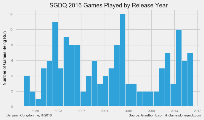
In this graph, you can rather clearly see 3 large segments of games. There’s a fairly high representation of games from the past ~6 years, a big chunk around the mid-2000s, and a more broad swath of 90’s games. So, all-in-all a fairly good selection of games from the past ~30 years.
Speedrun Time
I also thought it would be interesting to see how time-to-run was distributed by release year. (These running times are estimates, but I’ve noticed in past years that they tend to be fairly accurate)
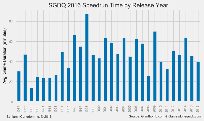
I was a bit disappointed by this graph. There aren’t any super obvious trends, other than a noticeable dip in games from the early 90’s. Past then, runtime does not seem to be much affected by release year.
For the sake of completeness, I also drew up a histogram of speed run times.
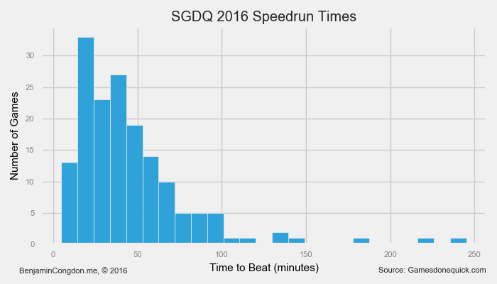
This was at least a bit more interesting; it’s clear to see that there’s a bell curve between the 0 and ~100 minutes to beat, with a long tail going out to a whopping 245 minutes to beat.
It’s worth pointing out around now some min/maxes:
-
Fastest run: Celeste on PC (5 min)
-
Longest run: Final Fantasy VI on SNES (4 hr 5 min)
-
Oldest game being run: Zelda II: The Adventure of Link (NES, 1/14/1987)
-
Newest game being run: Momodora: Reverie Under the Moonlight (PC, 3/4/2016)
Speedrun Time vs Release Date (redux)
This was by far the graph I was happiest with - to the point where I’m considering doing a interactive D3.js version.
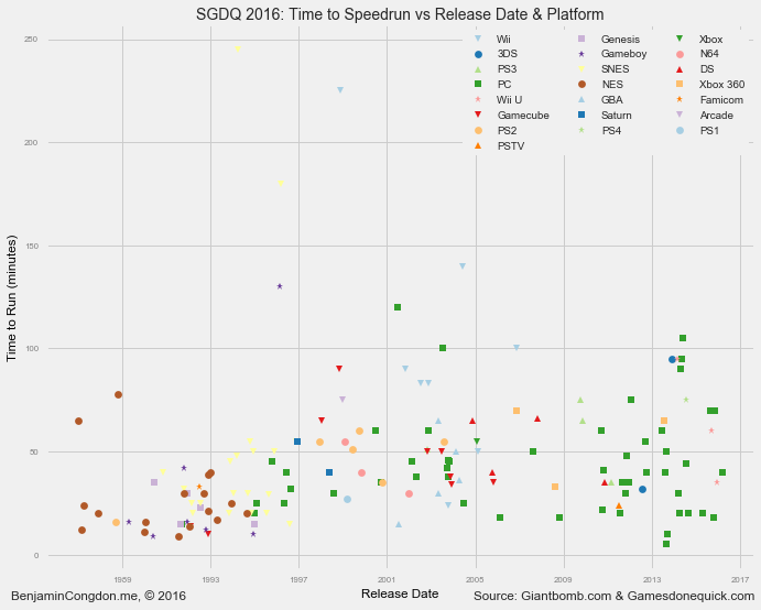
The premise again was to see how speedrun time related to release date. This time, however, I threw in the variable of run platform by varying the marker type/color. This added dimension really made the scatter plot ‘pop’ for me.
Lessons Learned
This was the first set of visualizations where I spent a good amount of time trying to get the aesthetic to be appealing. I think I’ve improved in that respect from, say, my Hackathon Hacker Website visualization project, but there’s still room to grow.
There’s definitely an aspect of ’less is more’ in data visualization, so as to let the data do the talking instead of grabbing attention with axis titles or other marginally important features.
Additionally, the lack of interactivity in matplotlib visualizations really limits what you can do with the medium, which is why I’ve come to see it more as a prototyping tool for something more advanced in, say, D3.
If you want to see any of the source of this project, or look at higher res renders of these graphs, everything - including the Jupyter notebook - is hosted here on my Github.
On the Horizon
Speaking of D3, I’ve decided to do a more involved project related to SGDQ that I’m not quite ready to talk about yet - suffice it to say, it will be an interactive data visualization.
Once that project is ready, it’ll be hosted at gdqstat.us. 😁